直方图表示被存储到范围中的变量的值的频率。 直方图类似于条形图,但不同之处在于将值分组为连续范围。 直方图中的每个柱表示该范围中存在的值的数量的高度。
R语言使用hist()函数创建直方图。 此函数使用向量作为输入,并使用一些更多的参数来绘制直方图。
语法
使用R语言创建直方图的基本语法是 –
hist(v,main,xlab,xlim,ylim,breaks,col,border)
以下是所使用的参数的描述 –
-
v是包含直方图中使用的数值的向量。
-
main表示图表的标题。
-
col用于设置条的颜色。
-
border用于设置每个条的边框颜色。
-
xlab用于给出x轴的描述。
-
xlim用于指定x轴上的值的范围。
-
ylim用于指定y轴上的值的范围。
-
break用于提及每个条的宽度。
例
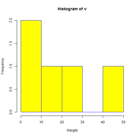
# Create data for the graph.
v <-  c(9,13,21,8,36,22,12,41,31,33,19)

# Give the chart file a name.
png(file = "histogram.png")

# Create the histogram.
hist(v,xlab = "Weight",col = "yellow",border = "blue")

# Save the file.
dev.off()
当我们执行上面的代码,它产生以下结果 –
X和Y值的范围
xlim
ylim
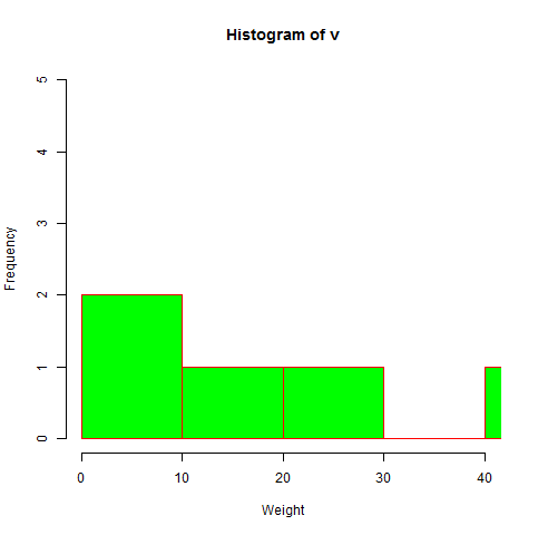
# Create data for the graph.
v <- c(9,13,21,8,36,22,12,41,31,33,19)

# Give the chart file a name.
png(file = "histogram_lim_breaks.png")

# Create the histogram.
hist(v,xlab = "Weight",col = "green",border = "red", xlim = c(0,40), ylim = c(0,5),
   breaks = 5)

# Save the file.
dev.off()
当我们执行上面的代码,它产生以下结果 –
转载请注明:www.ainoob.cn » R语言 直方图