折线图是通过在它们之间绘制线段来连接一系列点的图。 这些点在它们的坐标(通常是x坐标)值之一中排序。 折线图通常用于识别数据中的趋势。
R语言中的plot()函数用于创建折线图。
语法
在R语言中创建折线图的基本语法是 –
plot(v,type,col,xlab,ylab)
以下是所使用的参数的描述 –
-
v是包含数值的向量。
-
类型采用值“p”仅绘制点,“l”仅绘制线和“o”绘制点和线。
-
xlab是x轴的标签。
-
ylab是y轴的标签。
-
main是图表的标题。
-
col用于给点和线的颜色。
例
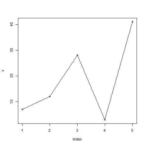
使用输入向量和类型参数“O”创建简单的折线图。 以下脚本将在当前R工作目录中创建并保存折线图。
# Create the data for the chart.
v <- c(7,12,28,3,41)

# Give the chart file a name.
png(file = "line_chart.jpg")

# Plot the bar chart.
plot(v,type = "o")

# Save the file.
dev.off()
当我们执行上面的代码,它产生以下结果 –
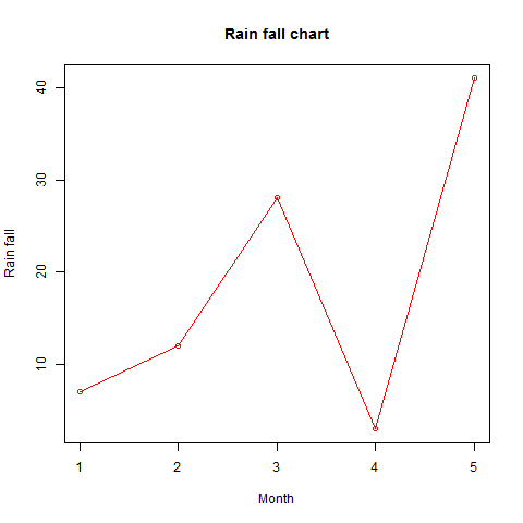
折线图标题,颜色和标签
线图的特征可以通过使用附加参数来扩展。 我们向点和线添加颜色,为图表添加标题,并向轴添加标签。
例
# Create the data for the chart.
v <- c(7,12,28,3,41)

# Give the chart file a name.
png(file = "line_chart_label_colored.jpg")

# Plot the bar chart.
plot(v,type = "o", col = "red", xlab = "Month", ylab = "Rain fall",
   main = "Rain fall chart")

# Save the file.
dev.off()
当我们执行上面的代码,它产生以下结果 –
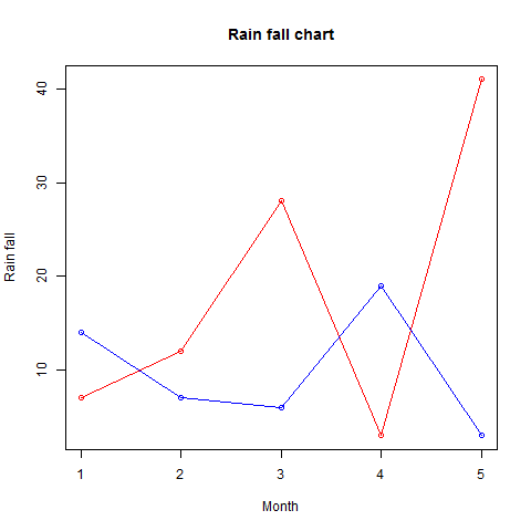
多线型折线图
()
# Create the data for the chart.
v <- c(7,12,28,3,41)
t <- c(14,7,6,19,3)

# Give the chart file a name.
png(file = "line_chart_2_lines.jpg")

# Plot the bar chart.
plot(v,type = "o",col = "red", xlab = "Month", ylab = "Rain fall",
   main = "Rain fall chart")

lines(t, type = "o", col = "blue")

# Save the file.
dev.off()
当我们执行上面的代码,它产生以下结果 –
转载请注明:www.ainoob.cn » R语言 折线图